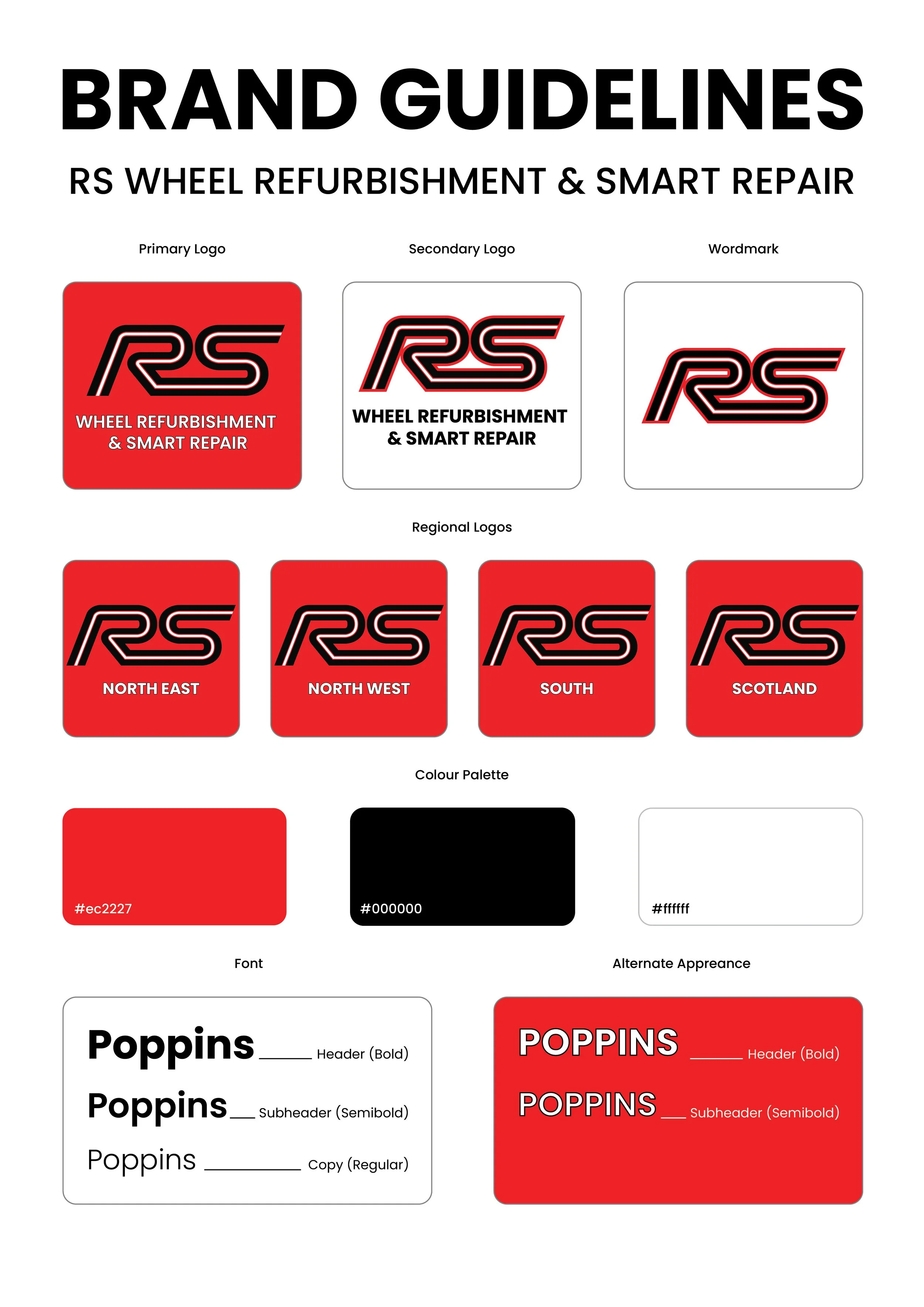
RS Wheels Rebrand
RS Wheels is a family business that in the past 10 years has grown simply from reputation and word-of-mouth.
As the business continued to grow, I joined the team to establish a marketing/design team from scratch. My first goal was to give the branding a complete update and a welcome into the modern world, as it had not been changed in over 10 years since the beginnings of the company.
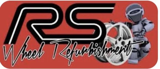
Original Branding
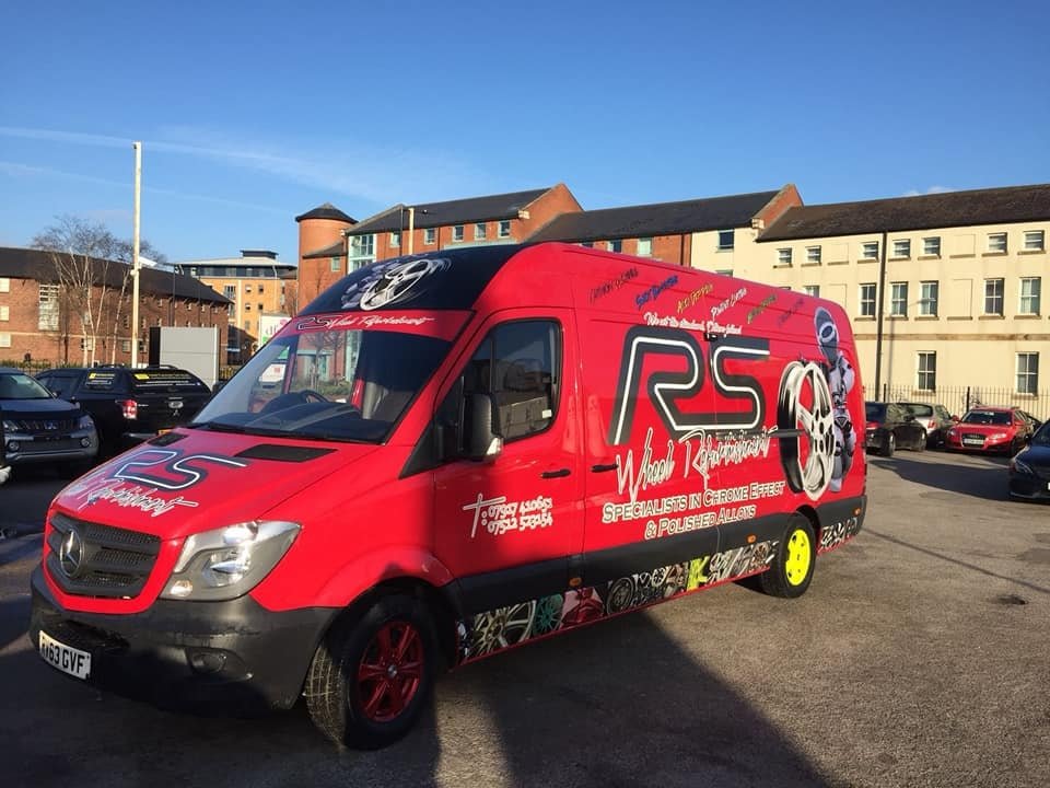
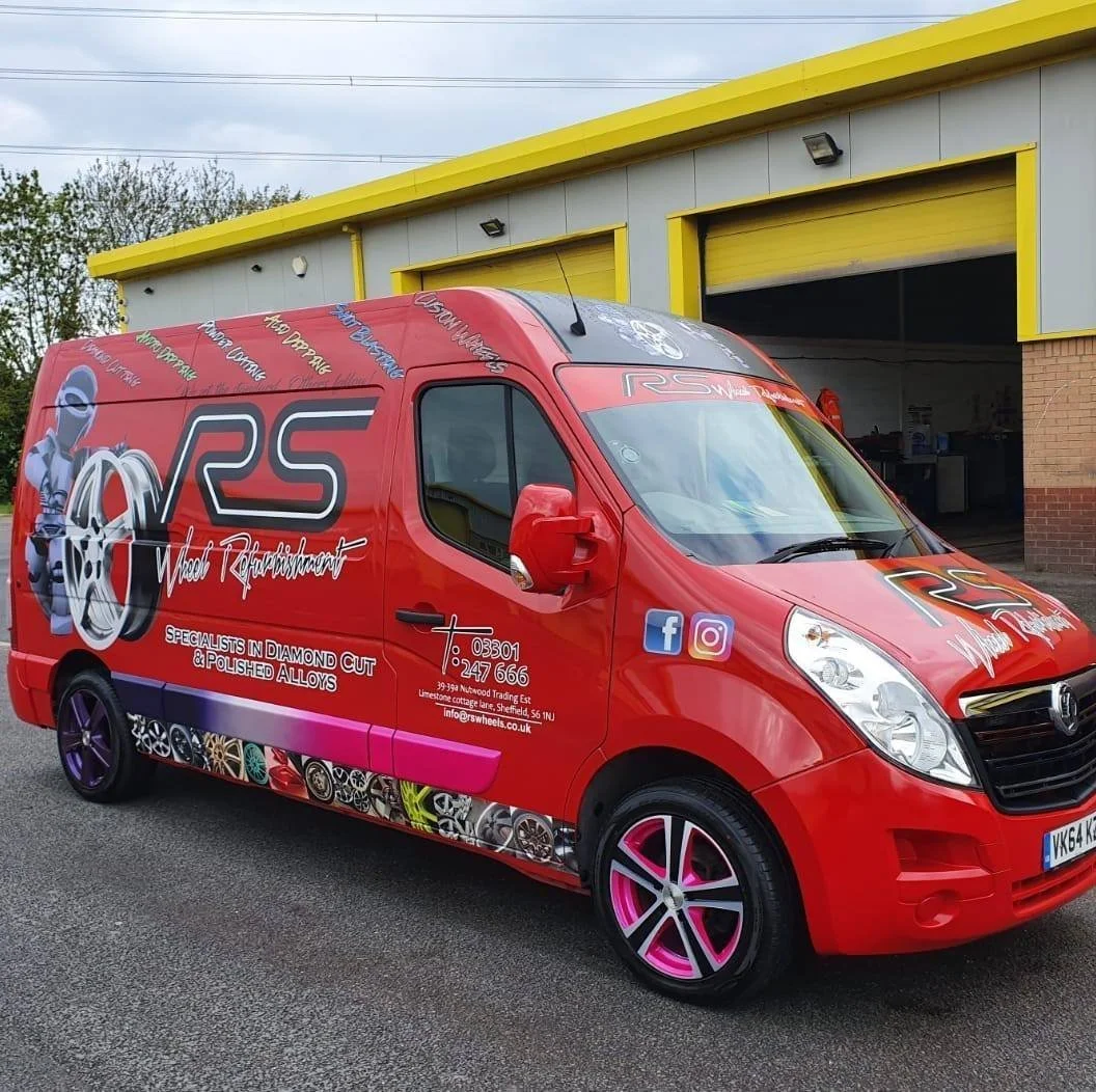
The branding that was in place when I joined the business was very visually overwhelming, especially compared to the branding of competitor companies and modern day standards.
The main rules given to me were that the ‘RS’ had to stay the same and so did their signature red. Past that I had free reign to do what I wanted. What I wanted was to strip it back and get rid of the visual noise and framing RS as a more professional and modern business.
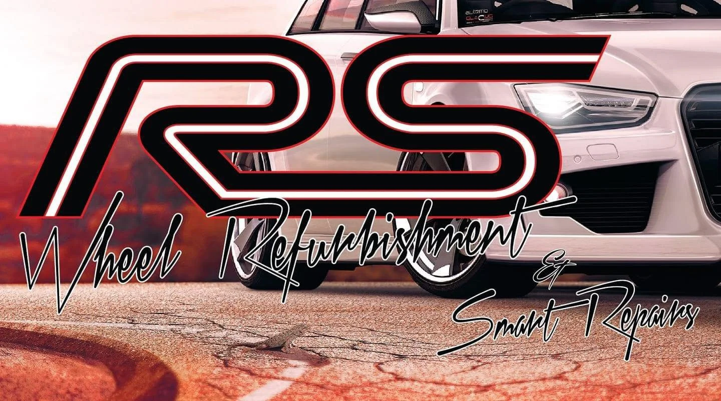
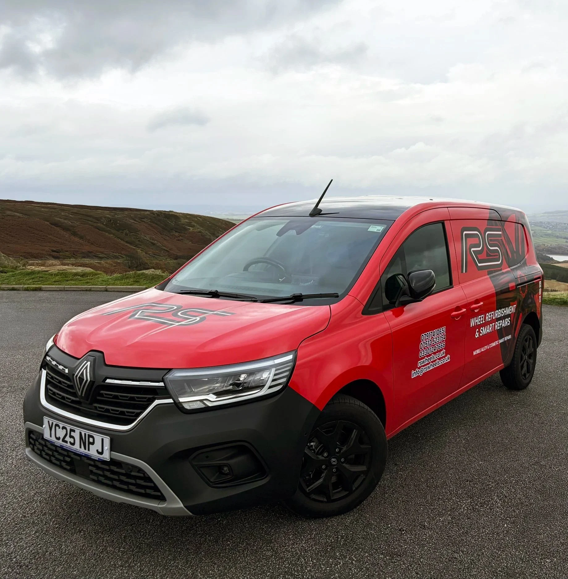
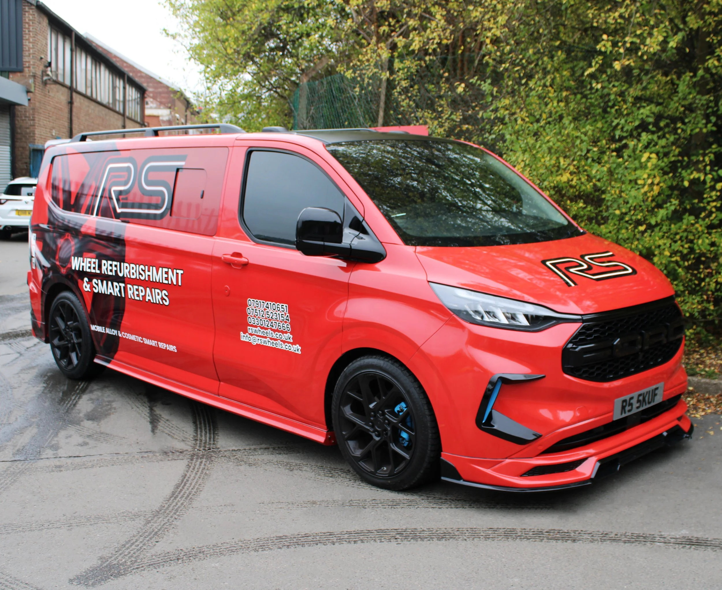
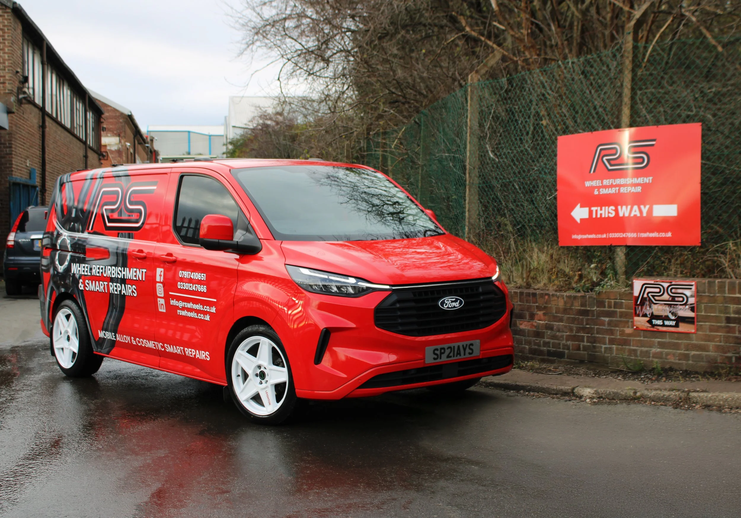
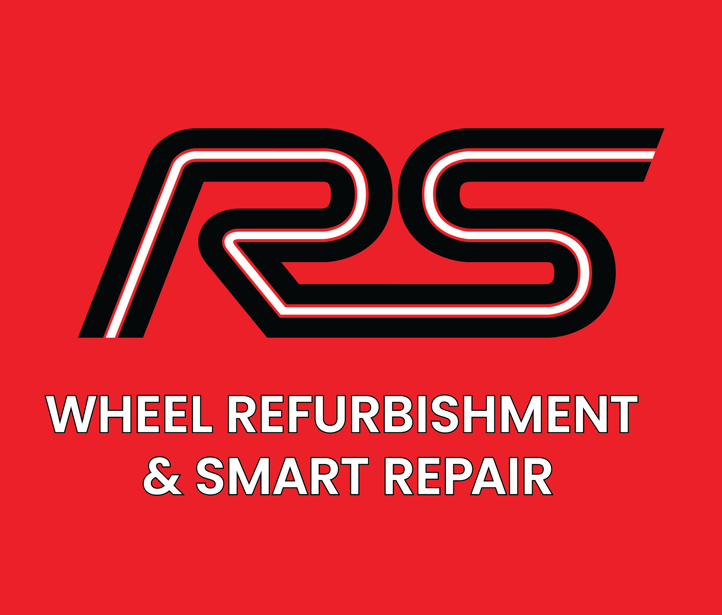
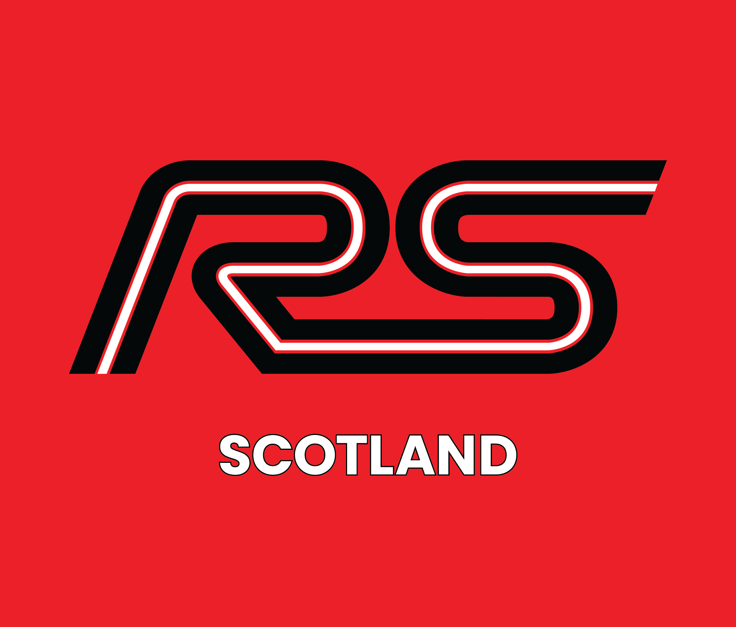
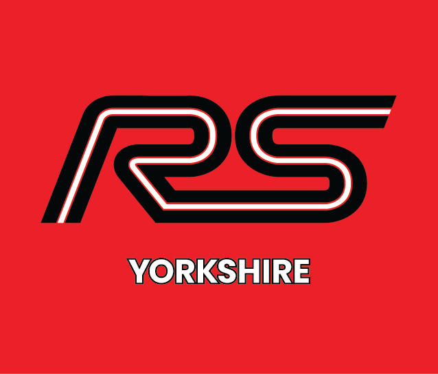
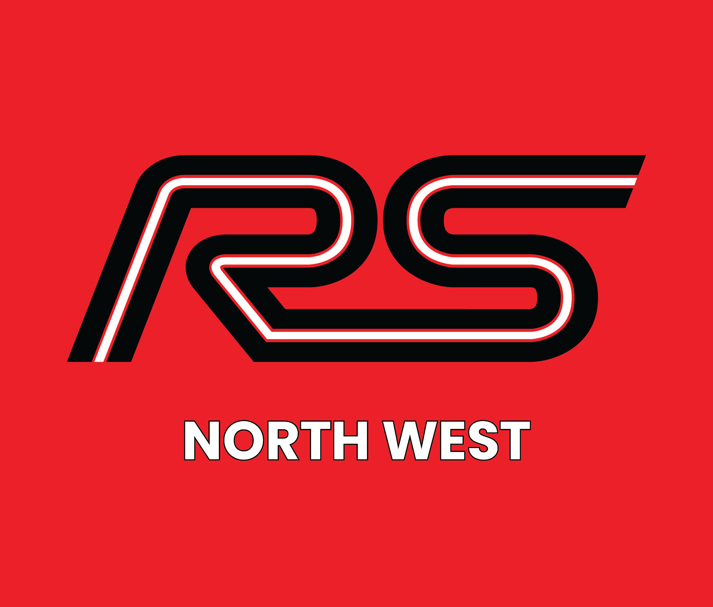
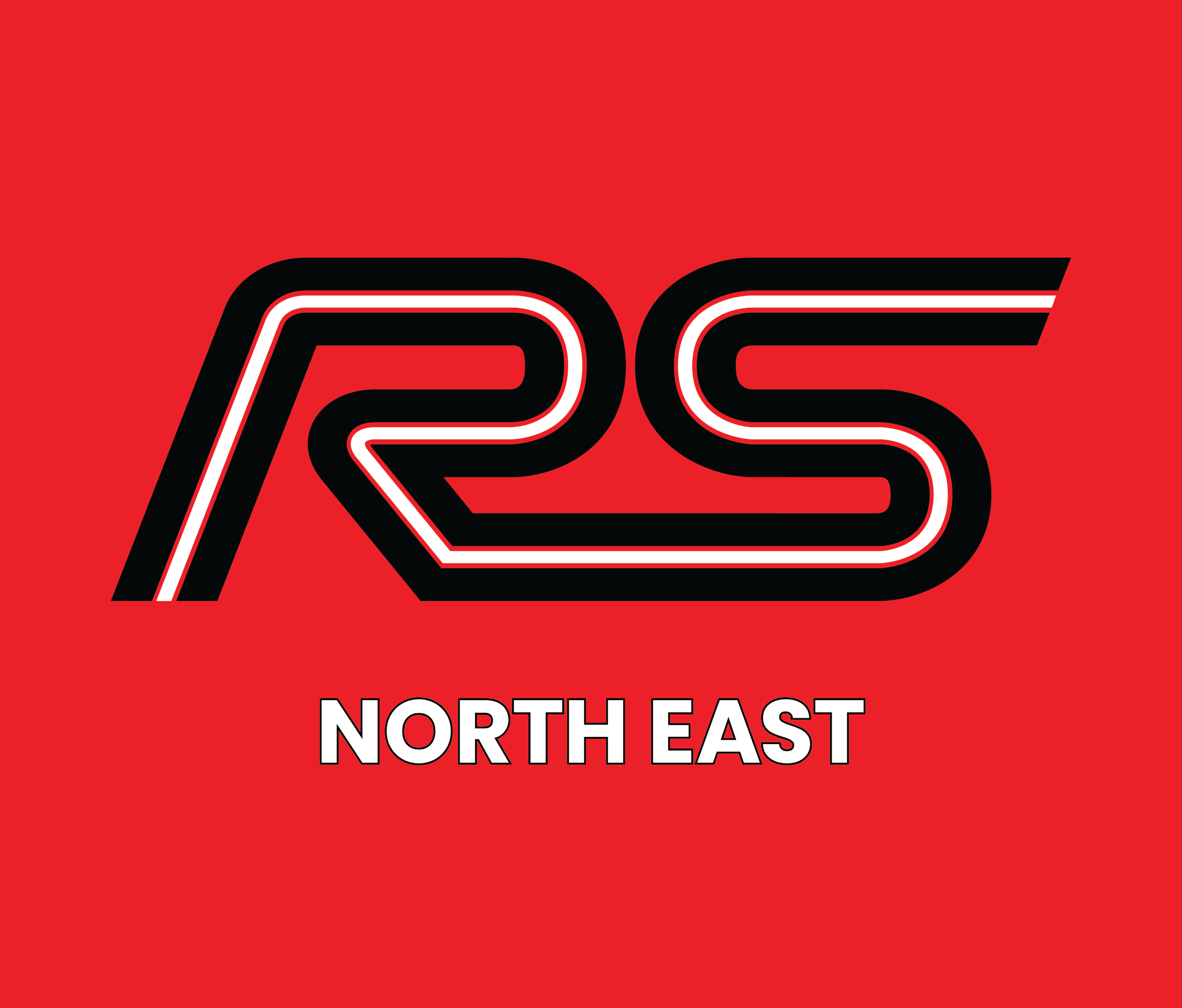
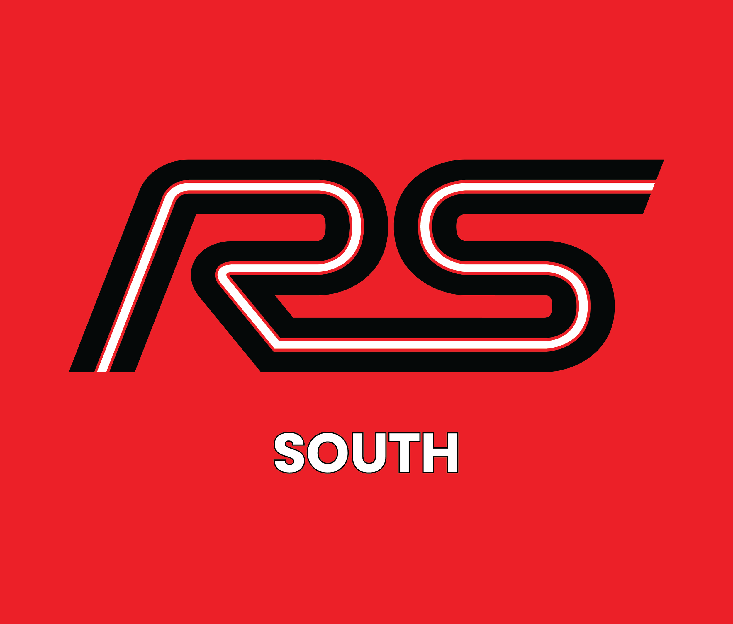
The New RS Wheels
Following the brief given, I chose a route that focussed more on a logo that would be more versatile across a variety of media and could be easily adapted when required. The short term plan was to strip all the branding back to more workable visuals and then long term, visuals such as the robot could be brought back in a more thought out fashion that would help boost the brand rather than overwhelm it.
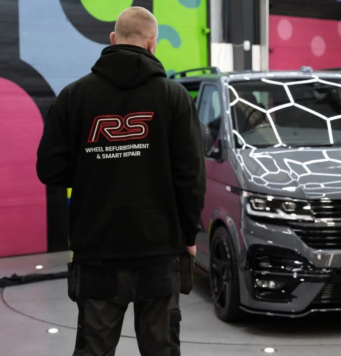
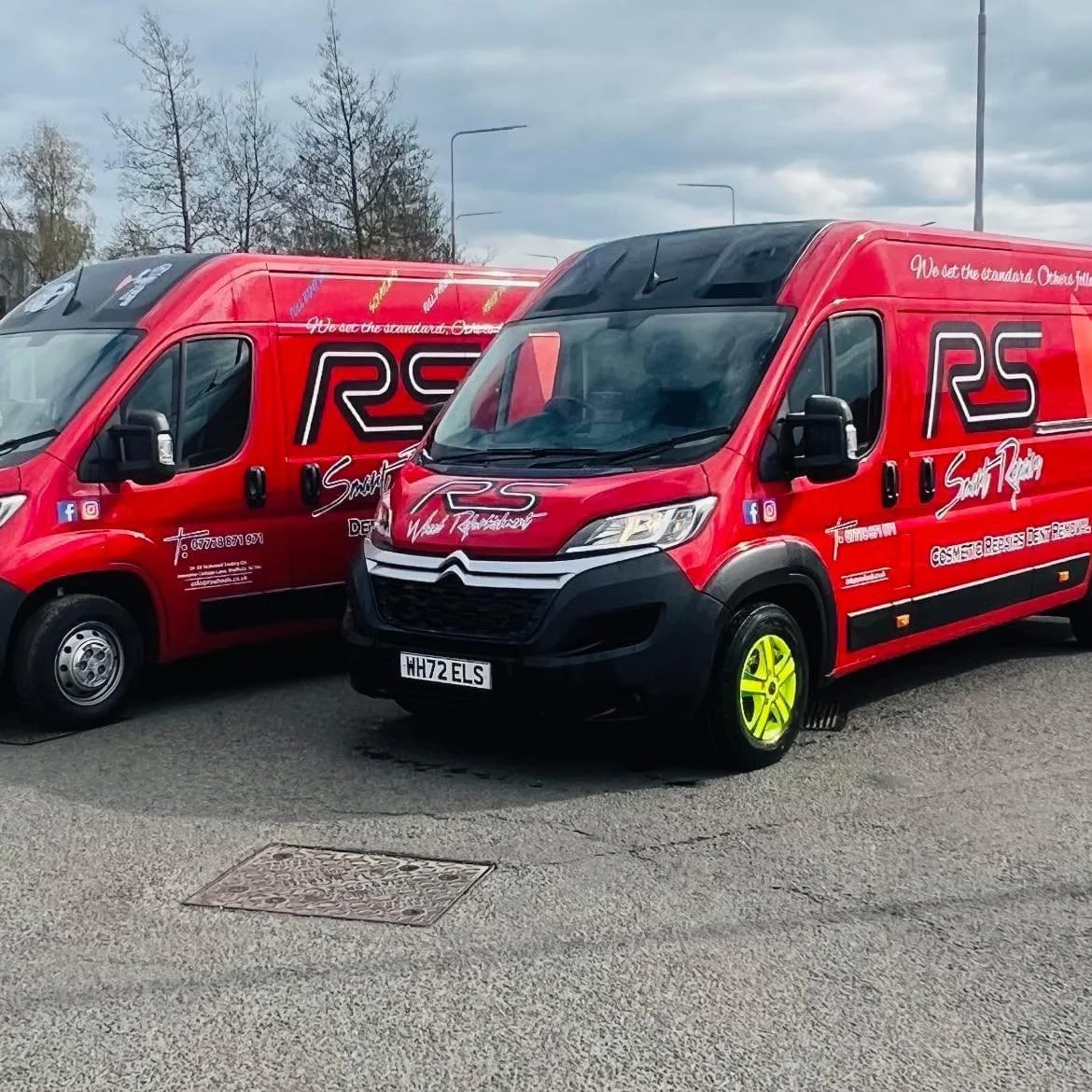
The biggest transformation occurred across the uniform and vans as they were the biggest visual overload. The goal was to make them easier to read when a vehicle was moving or at a distance.